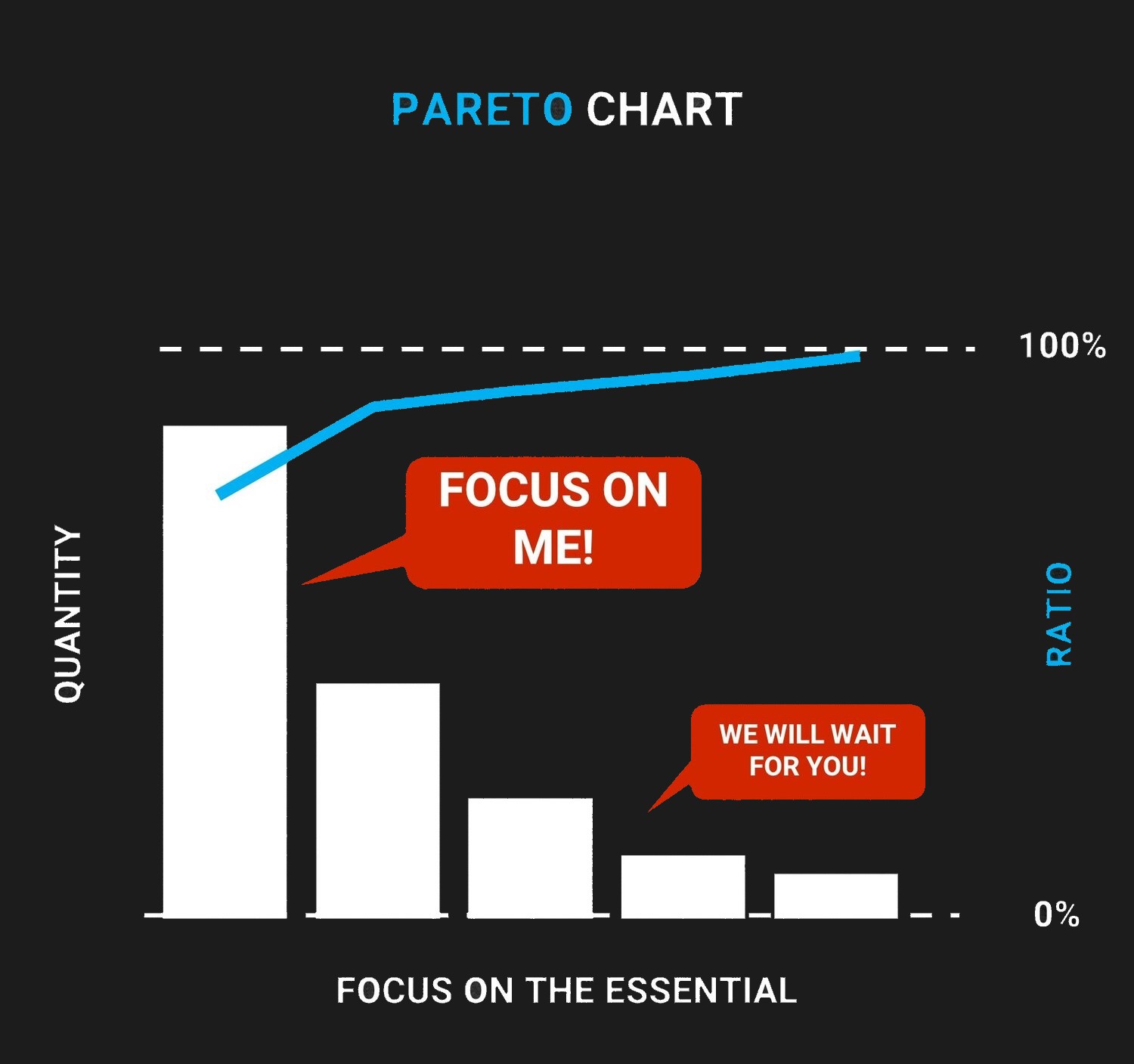
A Pareto Chart is used in order to determine the waste characteristics of a product/good but also of processes. They are sorted onto a cart so that the most frequent defects can be visualized and stand at first place.
Today, I am writing this blog post after discussing several times with colleagues who want to understand the Pareto chart (or Pareto diagram) more deeply.
The Pareto chart is one of the basic tools of quality management. Usually, this chart consists of a combined bar and line graph. The vertical bars are representing the quantity of defects, and the line represents a cumulative percentage of the defects.
The descending order of bars is from left to right. The bar on the left will have the highest value, and the bar on the right side will have the lowest value.
Let’s discuss this in detail.
Pareto Chart
Sometimes, it is challenging for you to understand the problems and their causes. Instead of focusing on the root cause, you spend your time, solving problems, which were influencing the project least.
The Pareto diagram can help you overcome this situation. The Pareto diagram can help you segregate the defects and their cause. Once you get this info, you can focus on the cause which is generating the most defects.
The Pareto diagram is based on the Pareto Principle, which was developed by an Italian economist named Vilfredo Pareto. He found out that 80% of the wealth was spread to 20% of the population. Therefore, pareto is also known as the 80/20 rule.
We could now list several examples where this rule is confirmed such as
80% of the defects are coming from 20% of the process
or
80% of customer complaints are coming from 20% of all defects detected
or
20% of the defects are causing 80% of the problems…
The list can go on and on.
In general, this phenomenon can be interpreted as follows: Roughly 80% of the problems will be due to 20% of the causes, or the majority of issues will be due to a small number of causes.
However, keep in mind that the above rule is a general rule and the ratio is not absolute.
The Pareto chart is mainly used in quality management or Six Sigma approaches. This chart helps you to find the majority of the problems and their root causes. You then should focus on tackling those causes and therefor solve the majority of the problems.
How to Draw a Pareto Chart
Drawing a Pareto chart is very simple. The most important step is to collect the correct data.
The steps to drawing a Pareto chart are as follows:
- Categorize your potential causes
- Specify the measure, e.g. quantity, costs per failure, downtime, etc.
- Set a time frame you measure, e.g. per shift, per week, etc.
- Measure Measure Measure (If you can’t measure you can’t control)
- Separate the data based on the categories
- Draw a bar chart with causes on horizontal axis and number of occurrences on the vertical axis (Excel gives you predefined templates)
- The category with the lowest quantity will be at the right and the highest quantity on the left
If you don’t have the histogram preset chart in excel – define a second row with the percentage value. Accumulated up to 100%. This will be your secondary axis. The values in percent will form the curve of distribution.
To make it short – it should look like above infographic.
Now, you can focus on the causes generating the majority of problems, analyze them, find their real root cause(s), and start to get rid of the issues one by one.
The chart can help everybody to identify causes of the most common problems. It also supports on prioritizing tasks and activities for Kaizen Workshops or simply fire fighting. Having some Excel skills, it is very easy to create a Pareto and also often helpful communicating your actions to the upper management – you can bring it to the point.


